

Le 10 migliori alternative a Domo per la reportistica finanziaria nel 2026

Alternative a Domo - Selezione


Le migliori alternative a Domo offrono dashboard finanziarie personalizzabili e intuitive, integrazione dei dati in tempo reale e funzionalità di reporting flessibili che ti aiutano a gestire con sicurezza set di dati finanziari complessi e di grandi dimensioni. Se stai cercando alternative a Domo, probabilmente hai bisogno di una soluzione che supporti una reportistica finanziaria accurata e tempestiva e che offra al tuo team una visibilità chiara sulle metriche chiave, analisi avanzate e informazioni utili per prendere decisioni operative.
Questo elenco ti aiuterà a confrontare le principali opzioni di software per dashboard finanziarie, così potrai trovare una piattaforma adatta ai tuoi requisiti di reporting, integrabile con i sistemi esistenti e in grado di supportare gli obiettivi finanziari della tua organizzazione.
Che cos'è Domo?
Domo è un software per dashboard finanziarie basato sul cloud che collega, visualizza e analizza dati provenienti da più fonti in tempo reale. Aiuta i team finanziari a creare dashboard interattive, automatizzare la reportistica e monitorare gli indicatori chiave di prestazione.
Domo viene utilizzato per migliorare la visibilità finanziaria, supportare il processo decisionale e ottimizzare i flussi di lavoro dei dati all'interno delle organizzazioni. Le sue integrazioni e funzionalità personalizzabili lo rendono una scelta popolare per le aziende che gestiscono dati finanziari complessi.
Riepilogo delle migliori alternative a Domo
Questa tabella comparativa riassume i dettagli sui prezzi delle mie migliori selezioni di alternative a Domo, per aiutarti a trovare quella più adatta al tuo budget e alle esigenze della tua azienda.
| Tool | Best For | Trial Info | Price | ||
|---|---|---|---|---|---|
| 1 | Ideale per dashboard di analisi visiva interattiva | Prova gratuita + piano gratuito disponibili | Da $15/utente/mese (con fatturazione annuale) | Website | |
| 2 | Ideale per un'esplorazione flessibile dei dati con analisi associativa | Prova gratuita di 30 giorni + demo gratuita disponibile | A partire da $300/mese (con fatturazione annuale) | Website | |
| 3 | Ideale per l'analisi basata su modelli e i rapporti incorporati in Google Cloud | Piano gratuito disponibile | A partire da $9/utente/progetto/mese | Website | |
| 4 | Ideale per analisi su larga scala con elaborazione interna al chip | Prova gratuita di 7 giorni + demo gratuita disponibile | Prezzi disponibili su richiesta | Website | |
| 5 | Ideale per analisi AWS scalabili con tariffazione per utente | Piano gratuito disponibile | A partire da $3/utente/mese | Website | |
| 6 | Ideale per la reportistica basata su Microsoft e il monitoraggio dei dati in tempo reale | Piano gratuito disponibile | A partire da £10.80/utente/mese (con fatturazione annuale) | Website | |
| 7 | Ideale per l'esplorazione e la visualizzazione open source dei dati | Scaricabile gratuitamente | Gratuito e open source | Website | |
| 8 | Ideale per la business intelligence open source con un semplice generatore di query | Piano gratuito disponibile | A partire da $90/mese (fatturato annualmente) | Website | |
| 9 | Ideale per analisi basate sulla ricerca e approfondimenti basati sull'IA | Prova gratuita di 14 giorni + demo gratuita disponibile | Da $25/user/month (fatturato annualmente) | Website | |
| 10 | Ideale per la gestione delle performance e la pianificazione strategica | Prova gratuita + demo gratuita disponibili | Prezzi su richiesta | Website |
Perché fidarsi dei nostri consigli sui software
Le nostre recensioni riflettono il nostro giudizio indipendente, non un discorso di vendita. Scopri come manteniamo la trasparenza.
Per questa guida, abbiamo valutato gli strumenti attraverso test pratici e ricerche indipendenti, assegnando un punteggio agli strumenti in base ai nostri criteri di selezione.
Le nostre recensioni riflettono il nostro giudizio editoriale umano, non un discorso di vendita.
Recensioni delle alternative a Domo
Di seguito trovi i miei riepiloghi dettagliati delle alternative a Domo che sono entrate nella mia selezione. Le mie recensioni offrono uno sguardo approfondito sulle funzionalità, le integrazioni e i prezzi di ogni software, per aiutarti a trovare quello più adatto a te.

Tableau
Ideale per dashboard di analisi visiva interattiva
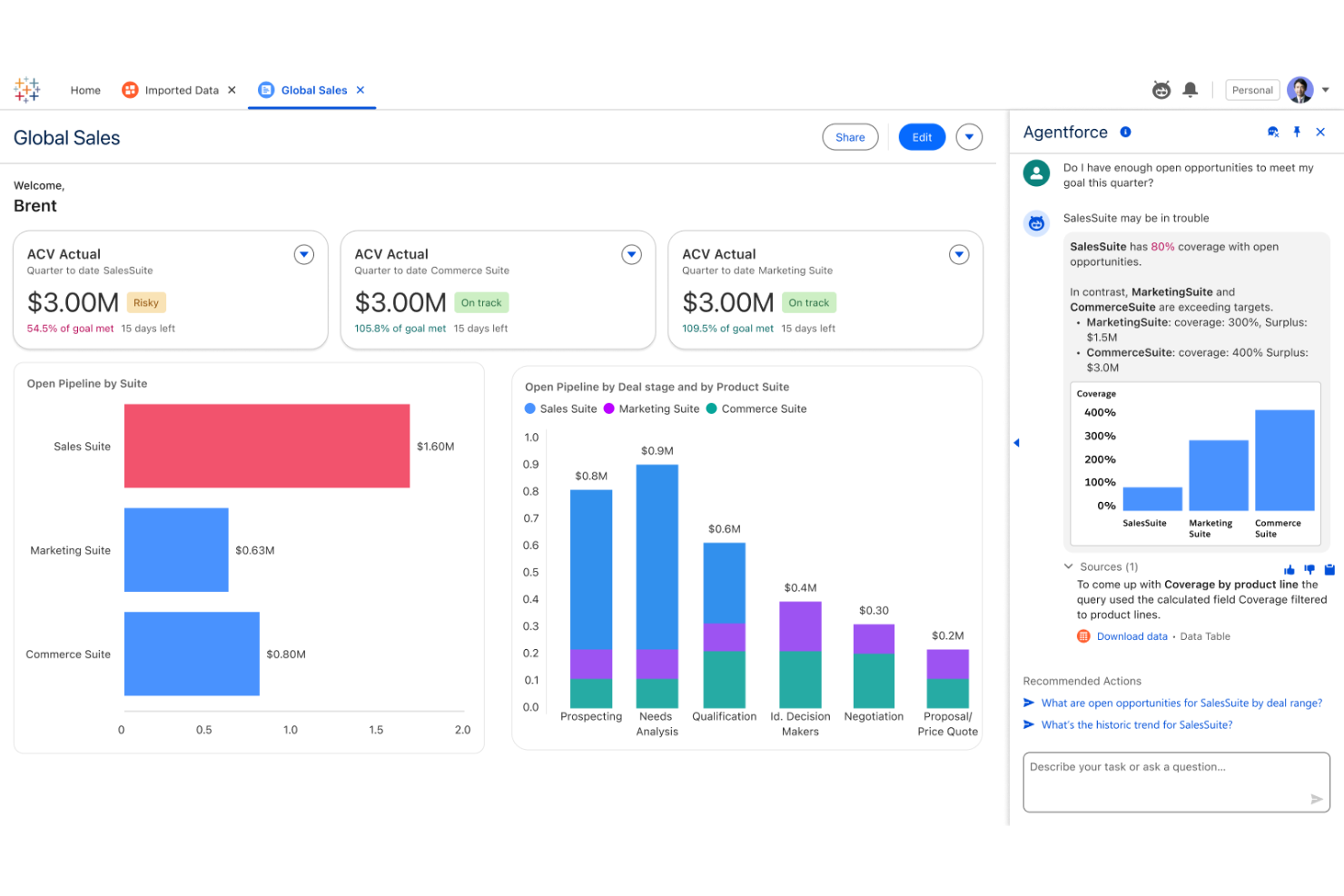
Tableau è progettato per i team finanziari e gli analisti che devono trasformare dati finanziari complessi in dashboard chiare e interattive. Le sue opzioni flessibili di visualizzazione aiutano a individuare le tendenze, monitorare i KPI e condividere informazioni con gli stakeholder di tutta l'organizzazione.
Per chi è più adatto Tableau?
I professionisti della finanza e gli analisti delle organizzazioni di medie e grandi dimensioni hanno bisogno di visualizzazioni avanzate dei dati e di dashboard personalizzabili.
Perché Tableau è una buona alternativa a Domo
Ho scelto Tableau per questo elenco per la sua profondità nell'analisi visiva e nella progettazione di dashboard interattive. Mi piace il modo in cui l'interfaccia con trascinamento di Tableau consente al mio team di creare dashboard finanziarie personalizzate senza scrivere codice, acquisendo dati in tempo reale da fonti come database SQL e fogli di calcolo.
Apprezzo anche la funzionalità dei campi calcolati di Tableau, che mi consente di creare metriche finanziarie personalizzate direttamente all'interno di una visualizzazione. In pratica, questo significa che il mio team può creare dashboard per l'analisi degli scostamenti che si aggiornano automaticamente quando arrivano nuovi dati.
Funzionalità principali di Tableau
- Previsioni basate sull'AI: Tableau si integra con R, Python e MATLAB per eseguire modelli predittivi e visualizzare i risultati direttamente nelle dashboard.
- Interrogazioni in linguaggio naturale: Poni domande sui dati in linguaggio semplice e ottieni risposte visive immediate senza creare manualmente un grafico.
- Acceleratori per dashboard: Modelli di dashboard predefiniti e specifici per settore, che puoi distribuire e compilare con i tuoi dati finanziari.
- Accesso offline ai dati: Tableau Desktop consente di connettersi ai dati, esplorarli e analizzarli senza una connessione Internet.
Integrazioni di Tableau
Le integrazioni includono Salesforce, Google Analytics, Amazon Redshift, Microsoft Excel, Snowflake, Oracle, SAP, Google BigQuery, Microsoft SQL Server e Dropbox.
Pros and Cons
Pros:
- Opzioni avanzate di visualizzazione per i dati finanziari
- Supporto efficace per le connessioni ai dati in tempo reale
- Ampia libreria di modelli di dashboard predefiniti
Cons:
- Richiede licenze separate per la distribuzione del server
- Funzionalità limitate di scrittura diretta per l'inserimento dei dati

Qlik
Ideale per un'esplorazione flessibile dei dati con analisi associativa
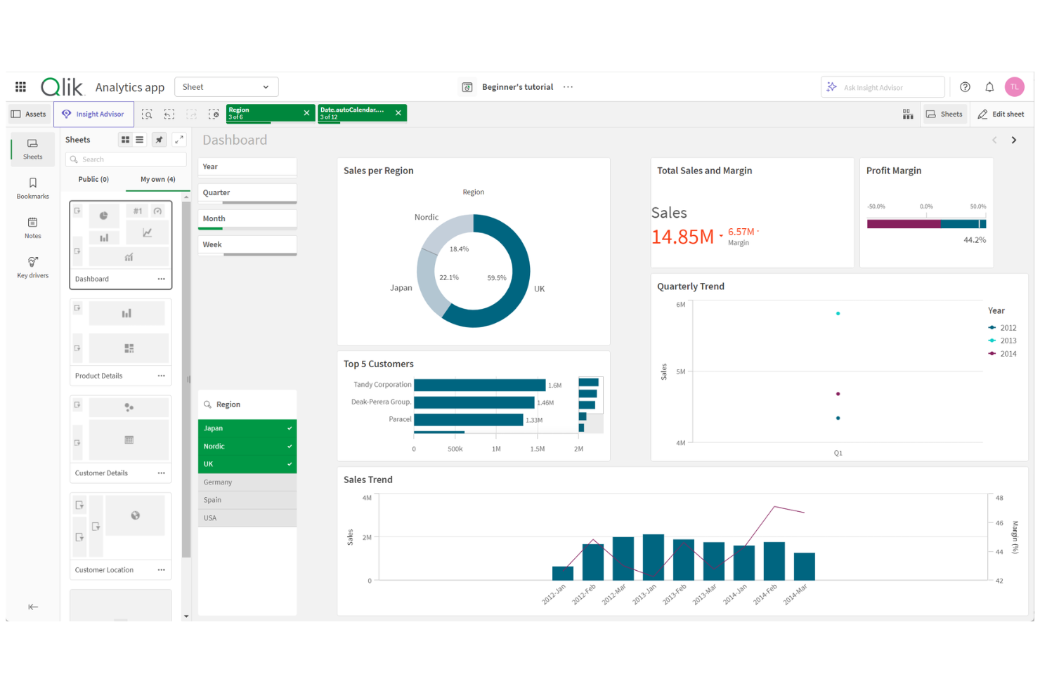
Qlik è una piattaforma di analisi dei dati progettata per i team finanziari e gli analisti che devono esplorare e visualizzare dati finanziari complessi provenienti da più fonti. Il suo motore associativo aiuta gli utenti a scoprire tendenze e relazioni nascoste che i pannelli di controllo tradizionali potrebbero non rilevare.
Per chi è più indicato Qlik?
Team finanziari e di analisi di aziende di medie e grandi dimensioni che necessitano di un'esplorazione avanzata dei dati in memoria provenienti da più fonti.
Perché Qlik è una buona alternativa a Domo
Ho scelto Qlik perché il suo motore associativo permette al mio team di esplorare i dati finanziari in modi che gli strumenti lineari basati sulle query semplicemente non consentono. A differenza dei pannelli di controllo tradizionali, Qlik mantiene in memoria tutte le relazioni tra i dati, quindi posso selezionare dimensioni come centro di costo, periodo o entità e vedere immediatamente come le selezioni si ripercuotono su ogni metrica collegata.
Apprezzo anche la ricerca intelligente di Qlik Sense, che consente al mio team di digitare query in linguaggio naturale direttamente in un pannello di controllo finanziario e visualizzare i dati pertinenti senza creare una nuova relazione. In pratica, possiamo analizzare al volo le variazioni di budget o le anomalie dei ricavi, senza dover aspettare che un analista dei dati esegua una nuova query.
Funzionalità principali di Qlik
- Qlik Predict: Eseguire modelli predittivi senza codice e scenari ipotetici direttamente nei pannelli di controllo per prevedere risultati finanziari come l'andamento dei ricavi o dei costi.
- Avvisi intelligenti: Impostare avvisi basati sui dati che monitorano continuamente tutti i dati, non solo singole visualizzazioni, e attivano azioni automatizzate quando vengono raggiunte determinate soglie.
- Reportistica programmata: Creare e distribuire relazioni formattate nei formati Microsoft Office e PDF secondo una pianificazione prestabilita, con consegna tramite e-mail o cartelle condivise.
- Catalogo dati autogestito: Consultare un catalogo ricercabile di insiemi di dati pronti per l'analisi, con dettagli sulla provenienza e sulla genealogia dei dati, così che i team finanziari possano individuare e considerare affidabili i dati utilizzati.
Integrazioni di Qlik
Le integrazioni includono AWS, Google, Microsoft, Snowflake, SAP, Databricks, Cloudera, Salesforce, Oracle e Teradata.
Pros and Cons
Pros:
- Il motore associativo rivela relazioni finanziarie nascoste
- L'analisi in memoria consente un'esplorazione rapida dei dati
- Avvisi avanzati per il monitoraggio finanziario in tempo reale
Cons:
- Le visualizzazioni possono richiedere una messa a punto manuale
- Requisiti di risorse elevati per implementazioni di grandi dimensioni

Looker
Ideale per l'analisi basata su modelli e i rapporti incorporati in Google Cloud
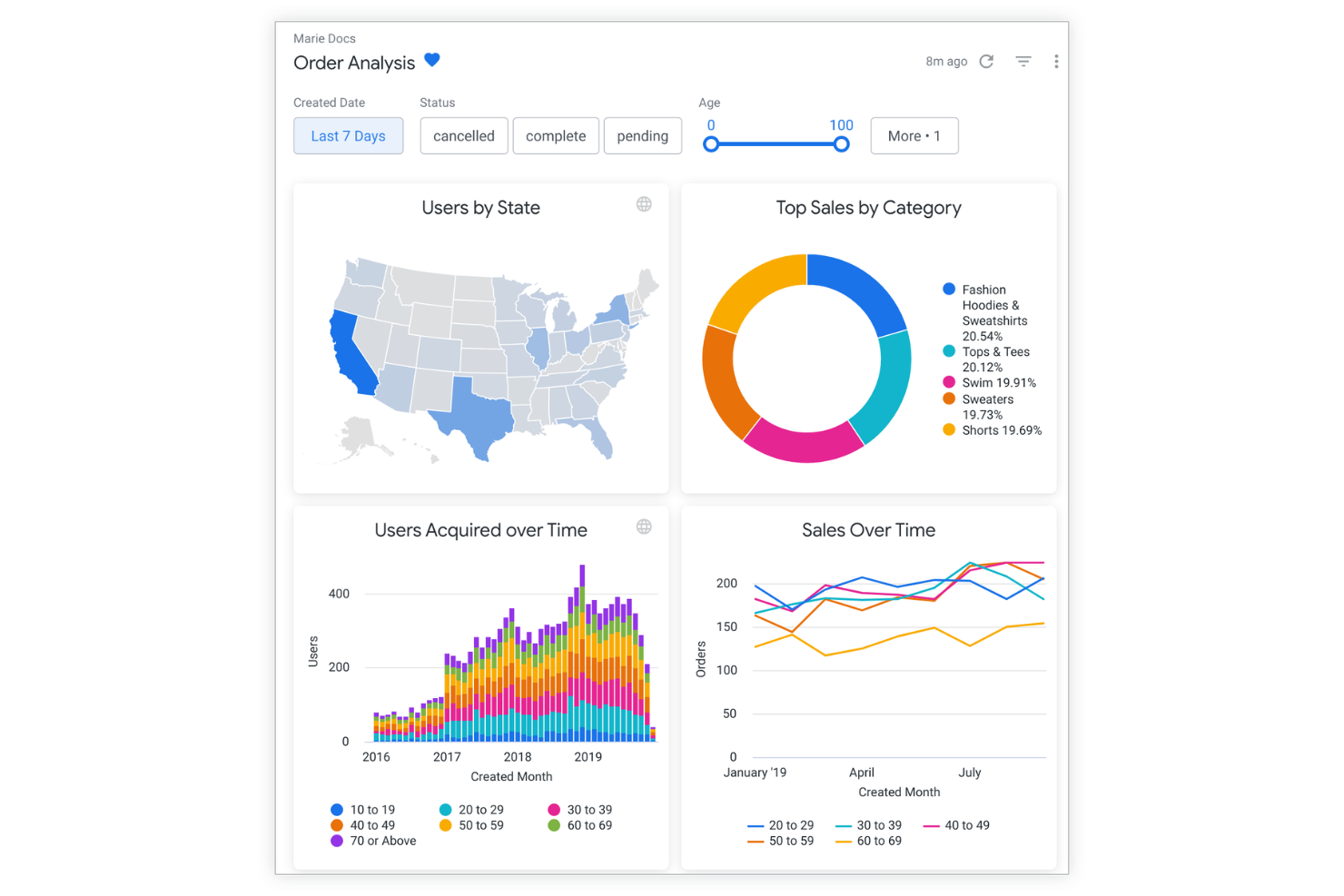
Looker è una piattaforma di analisi basata sul cloud, progettata per i gruppi finanziari e gli analisti che devono fornire rapporti regolamentati e coerenti tra i vari reparti. Il suo livello di modellazione è ideale per le organizzazioni che cercano pannelli di controllo affidabili e scalabili, in linea con metriche e definizioni aziendali.
Per chi è più adatto Looker?
I gruppi finanziari e di analisi delle grandi organizzazioni necessitano di rapporti regolamentati a livello aziendale e di definizioni coerenti delle metriche.
Ciò che mi attrae di Looker è il suo livello di modellazione LookML, che consente al mio gruppo di definire una sola volta metriche come il margine lordo o la rilevazione dei ricavi e di riutilizzarle in modo coerente in ogni pannello di controllo e rapporto. Questa singola fonte di verità è importante quando i gruppi finanziari delle diverse unità aziendali devono estrarre gli stessi KPI senza ottenere dati diversi.
Apprezzo anche il fatto che la funzionalità Explore di Looker consenta agli analisti di passare da un riepilogo finanziario di alto livello ai dettagli delle transazioni a livello di riga senza uscire dal pannello di controllo. In pratica, ciò significa che il mio gruppo può analizzare una variazione nelle spese operative e risalire alle singole voci in pochi minuti, non in giorni.
Funzionalità principali di Looker
- Analisi conversazionale: poni domande sui dati in linguaggio naturale utilizzando l'interfaccia conversazionale basata su Gemini, senza bisogno di competenze di analisi aziendale.
- Integrazione con Connected Sheets: esplora i dati modellati con LookML direttamente in Google Sheets, portando le metriche regolamentate nei flussi di lavoro basati su fogli di calcolo.
- Distribuzione programmata: configura l'invio automatico di pannelli di controllo e rapporti secondo una pianificazione ricorrente tramite e-mail o altre destinazioni.
- Accesso degli utenti basato sui ruoli: assegna agli utenti i ruoli di visualizzatore, utente standard o sviluppatore per controllare ciò che ciascun utente può interrogare, creare o amministrare all'interno della piattaforma.
Integrazioni di Looker
Le integrazioni includono BigQuery, Google Sheets, Google Analytics, Vertex AI, Google Workspace, Gmail, Google Drive, Google Meet, Looker Studio e Connected Sheets.
Pros and Cons
Pros:
- Il livello di modellazione regolamentato garantisce la coerenza delle metriche
- Integrazione approfondita con Google Cloud Platform
- Supporta l'esplorazione granulare dei dati a livello di riga
Cons:
- Un numero inferiore di modelli predefiniti di pannelli di controllo finanziari
- Nessuno strumento ETL o di preparazione dei dati integrato

Sisense
Ideale per analisi su larga scala con elaborazione interna al chip
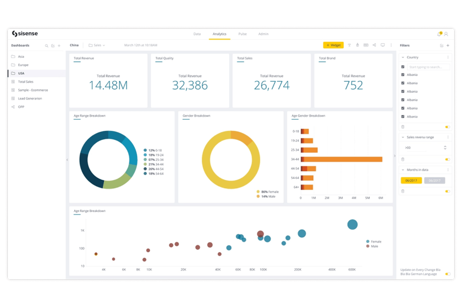
Sisense offre una piattaforma di analisi flessibile progettata per i team finanziari e i responsabili di prodotto che devono integrare i dashboard direttamente nelle proprie applicazioni o nei propri flussi di lavoro. Il suo approccio personalizzabile aiuta le organizzazioni a fornire agli utenti approfondimenti finanziari su misura senza affidarsi a report generici pronti all'uso.
Per chi è più adatto Sisense?
Team finanziari e di prodotto di aziende SaaS che devono integrare le analisi nelle proprie piattaforme.
Perché Sisense è una buona alternativa a Domo
Ho scelto Sisense in particolare per la sua capacità di analisi integrata, che consente al mio team di creare dashboard finanziari direttamente nei nostri strumenti interni e nelle applicazioni rivolte ai clienti utilizzando l'API JavaScript e l'SDK di Sisense. Ciò che apprezzo maggiormente è il framework Fusion, che mi permette di personalizzare l'aspetto, lo stile e il comportamento di ogni dashboard affinché corrisponda all'interfaccia del nostro prodotto, invece di sembrare uno strumento di terze parti.
In pratica, ciò significa che gli stakeholder finanziari visualizzano i KPI finanziari direttamente nelle piattaforme che già utilizzano quotidianamente. Per i team che necessitano di qualcosa di più di uno strumento BI autonomo, questo livello di flessibilità nell'integrazione è difficile da eguagliare.
Caratteristiche principali di Sisense
- Assistente IA: poni domande sui dati in linguaggio naturale per generare visualizzazioni e riepiloghi senza scrivere query.
- Connettività dei dati: connettiti a oltre 400 origini dati, con opzioni per consolidare i dati in Sisense o mantenere una connessione attiva al tuo data warehouse.
- Previsioni e rilevamento delle tendenze: visualizza approfondimenti predittivi e anomalie nei dashboard per aiutare i team finanziari ad anticipare i cambiamenti nelle metriche chiave.
- Distribuzione nel cloud: accedi a un ambiente ospitato nel cloud con aggiornamenti automatici e collaborazione multiutente su dashboard e modelli di dati.
Integrazioni di Sisense
Le integrazioni includono Snowflake, Amazon Redshift, Google BigQuery, Microsoft SQL Server, Oracle, Salesforce, Google Analytics, PostgreSQL, MySQL e MongoDB.
Pros and Cons
Pros:
- Integra i dashboard direttamente nelle applicazioni web
- Opzioni altamente personalizzabili per la progettazione dei dashboard
- Gestisce grandi volumi di dati con tecnologia interna al chip
Cons:
- Non include strumenti integrati per ETL o preparazione dei dati
- Le visualizzazioni richiedono una configurazione manuale

Ideale per analisi AWS scalabili con tariffazione per utente
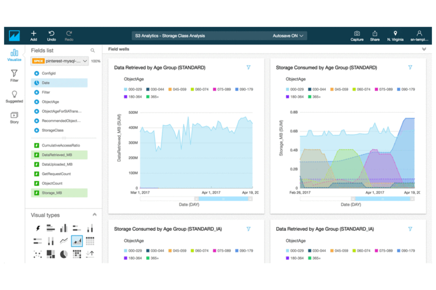
Amazon QuickSight è una piattaforma di business intelligence nativa del cloud, progettata per le organizzazioni che desiderano analizzare e condividere dati finanziari su larga scala all'interno dell'ecosistema AWS. È adatta ai team finanziari che cercano analisi integrate, dashboard interattive e report scalabili direttamente collegati alle proprie origini dati AWS.
Per chi è più adatto Amazon QuickSight?
Team finanziari e di analisi di aziende incentrate su AWS che necessitano di dashboard e report integrati e scalabili.
Perché Amazon QuickSight è una buona alternativa a Domo
Ho scelto Amazon QuickSight perché il suo modello di tariffazione a consumo per sessione significa che il mio team paga solo quando qualcuno apre effettivamente una dashboard, non una tariffa fissa per utente indipendentemente dall'utilizzo. Questo lo rende molto più conveniente per le organizzazioni in cui le dashboard finanziarie vengono condivise ampiamente tra i reparti, ma non consultate quotidianamente.
Apprezzo anche SPICE, il motore di calcolo in memoria di QuickSight, che consente al mio team di eseguire query rapide su grandi set di dati finanziari senza caricare direttamente il database di origine.
Per gli stack nativi AWS, le connessioni dirette a S3, Redshift e Athena ci permettono di creare e pubblicare dashboard finanziarie senza trasferire i dati attraverso una pipeline separata.
Funzionalità principali di Amazon QuickSight
- Analisi integrate: consentono agli sviluppatori di incorporare dashboard interattive e visualizzazioni direttamente nelle applicazioni interne o rivolte ai clienti utilizzando un SDK JavaScript.
- Controlli degli accessi basati sui ruoli: assegnano le autorizzazioni sui dati a livello di utente o gruppo, consentendo ai team finanziari di condividere ampiamente le dashboard senza esporre dati riservati.
- Analisi degli scenari: consente agli utenti di eseguire query ipotetiche in linguaggio naturale per modellare gli esiti finanziari e verificare le ipotesi senza scrivere codice.
- Supporto alla conformità: soddisfa gli standard FedRAMP, HIPAA, PCI DSS, ISO e SOC, supportando i team finanziari che operano in base a severi requisiti normativi.
Integrazioni di Amazon QuickSight
Le integrazioni includono Amazon Redshift, Amazon RDS, Amazon S3, Amazon Athena, Amazon Aurora, Amazon DynamoDB, AWS Glue, Salesforce, Snowflake e ServiceNow.
Pros and Cons
Pros:
- La tariffazione per utente riduce i costi delle licenze inutilizzate
- L'integrazione nativa delle origini dati AWS è perfettamente fluida
- Il motore SPICE consente query rapide su larga scala
Cons:
- Si applica un costo infrastrutturale di $250/mese agli account utente Pro e a determinate funzionalità
- Mancano funzionalità integrate di automazione dei flussi di lavoro

Ideale per la reportistica basata su Microsoft e il monitoraggio dei dati in tempo reale

Microsoft Power BI è una piattaforma di analisi aziendale progettata per i team finanziari e gli analisti che devono visualizzare, condividere e collaborare sui dati finanziari. La sua integrazione con gli strumenti Microsoft 365 la rende una scelta efficace per le organizzazioni che utilizzano già Excel e altri prodotti Microsoft.
Per chi è più indicato Microsoft Power BI?
Professionisti della finanza e analisti aziendali presso organizzazioni che utilizzano Microsoft 365 e devono creare e condividere dashboard finanziari interattivi.
Ho scelto Microsoft Power BI per la sua stretta integrazione con gli strumenti Microsoft 365 che i team finanziari utilizzano già quotidianamente. Apprezzo il fatto che la funzionalità 'Analizza in Excel' consenta al mio team di importare direttamente in Excel i set di dati di Power BI per creare tabelle pivot e grafici, senza uscire dall'ambiente del foglio di calcolo.
Mi piace anche il modo in cui Power BI incorpora report aggiornati in tempo reale direttamente in Microsoft Teams e SharePoint, rendendo le dashboard finanziarie accessibili all'interno degli strumenti di collaborazione che il mio team utilizza già. In pratica, ciò significa che il mio team può condividere report sulle variazioni del budget o dashboard del flusso di cassa senza richiedere agli stakeholder di accedere a una piattaforma BI separata.
Funzionalità principali di Microsoft Power BI
- Visualizzazione delle query DAX: Scrivi, esegui e correggi i calcoli DAX direttamente nell'interfaccia di Power BI per creare metriche e misure finanziarie personalizzate.
- Hub dati OneLake: Centralizza i set di dati provenienti da più fonti in un unico repository di dati governato, che i team possono cercare, approvare e riutilizzare.
- Power BI Report Server: Distribuisci e gestisci i report in locale per le organizzazioni con requisiti di residenza dei dati o di conformità.
- Etichettatura della sensibilità tramite Microsoft Purview: Applica etichette di classificazione dei dati a report e set di dati per imporre controlli di accesso sui contenuti finanziari.
Integrazioni di Microsoft Power BI
Le integrazioni includono Microsoft Excel, Microsoft Teams, SharePoint, Dynamics 365, Azure Synapse Analytics, Salesforce, Google Analytics, SAP HANA, Oracle Database e Microsoft OneDrive.
Pros and Cons
Pros:
- Integrazione profonda con l'ecosistema Microsoft 365
- Efficaci funzionalità di modellazione dei dati basate su Excel
- Opzioni flessibili di distribuzione in locale e nel cloud
Cons:
- Licenze complesse per le distribuzioni aziendali
- Collaborazione limitata in tempo reale sulle dashboard
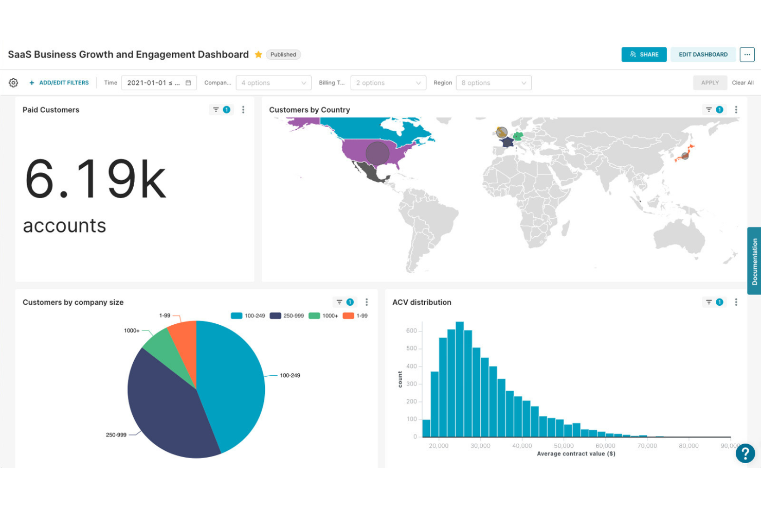
Superset è una piattaforma open source per l'esplorazione dei dati e la creazione di dashboard, progettata per i team che necessitano di personalizzazione avanzata e controllo sulle analisi finanziarie. È adatta ai professionisti della finanza e ai team di dati che desiderano progettare dashboard e visualizzazioni altamente personalizzate per esigenze di reporting complesse.
Per chi è più adatto Superset?
I team di dati e finanza delle aziende di medie e grandi dimensioni necessitano di una soluzione open source per la creazione di dashboard con personalizzazione avanzata.
Perché Superset è una buona alternativa a Domo
L'architettura open source di Superset è ciò che mi ha spinto a sceglierlo come alternativa a Domo: il mio team può ospitare autonomamente l'intera piattaforma e configurarla in base ai nostri requisiti specifici di sicurezza e infrastruttura.
Apprezzo SQL Lab, che consente agli analisti di scrivere e testare query personalizzate direttamente sui database finanziari, come Snowflake o BigQuery, senza dover uscire dalla piattaforma. L'architettura a plugin di Superset consente inoltre al mio team di creare tipi di grafici personalizzati oltre alle oltre 40 opzioni integrate, un aspetto importante quando le visualizzazioni standard non sono adatte alle esigenze di reporting finanziario complesso.
Funzionalità principali di Superset
- Livello semantico: Definisce una volta per tutte le metriche virtuali e le colonne calcolate, rendendole riutilizzabili in tutti i grafici e le dashboard.
- Controllo degli accessi basato sui ruoli (RBAC): Assegna le autorizzazioni per dataset e dashboard in base al ruolo, controllando chi può visualizzare o modificare i dati finanziari.
- Barra dei filtri nativa: Aggiunge filtri interattivi tra le dashboard, consentendo agli utenti di suddividere i dati finanziari per periodo, area geografica o categoria.
- Creazione di dashboard tramite trascinamento: Dispone e ridimensiona i grafici in una griglia senza scrivere codice.
Integrazioni di Superset
Le integrazioni includono Amazon Redshift, Google BigQuery, Snowflake, Microsoft SQL Server, PostgreSQL, MySQL, Oracle, MongoDB, Apache Druid e Google Sheets.
Pros and Cons
Pros:
- La distribuzione open source consente il pieno controllo dei dati
- Supporta analisi finanziarie avanzate basate su SQL
- Comunità attiva per la risoluzione dei problemi e le estensioni
Cons:
- Modelli finanziari pronti all'uso limitati
- Richiede configurazione tecnica e manutenzione continua

Metabase
Ideale per la business intelligence open source con un semplice generatore di query
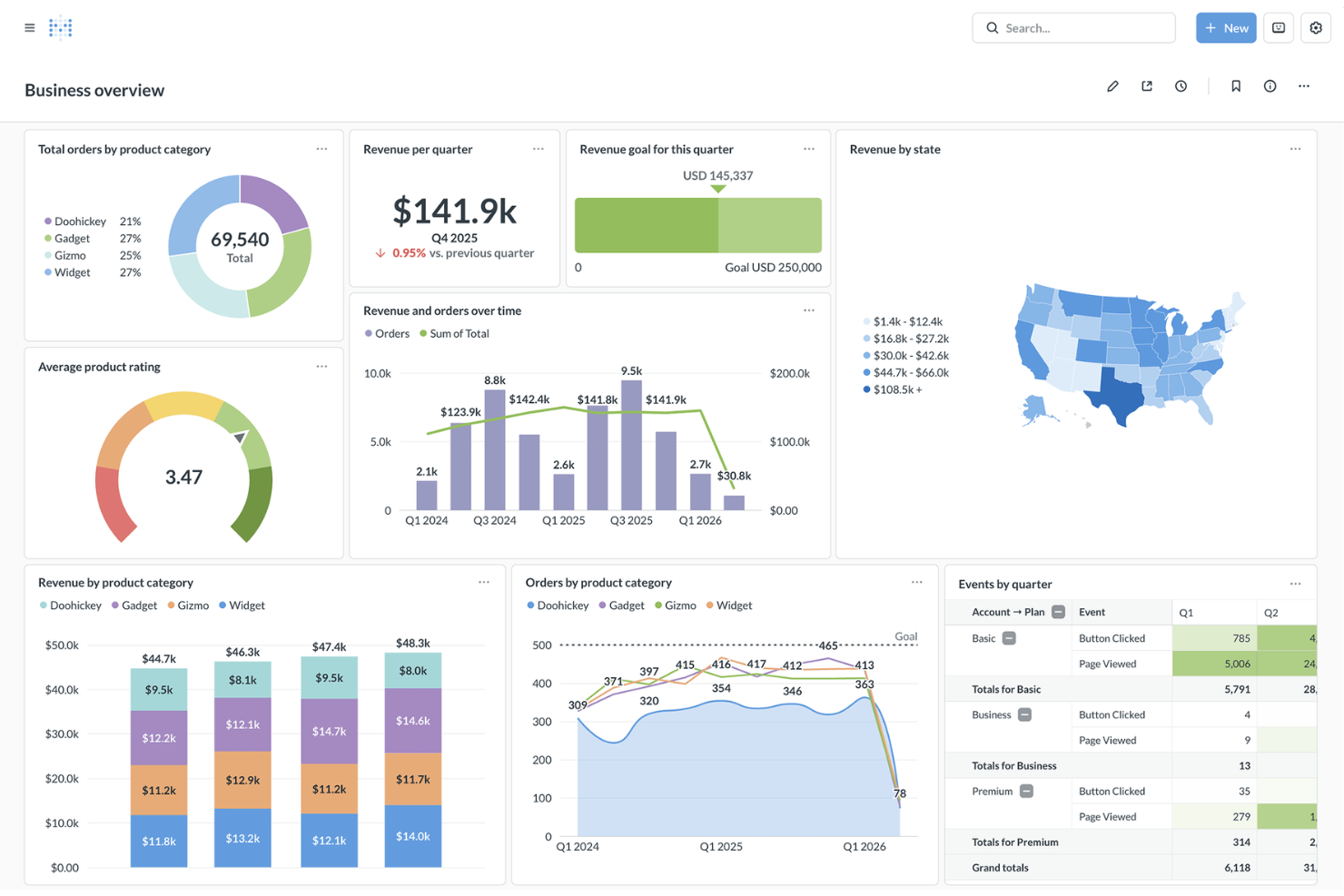
Metabase offre analisi e dashboard open source progettate per i team finanziari che desiderano accedere autonomamente ai dati senza un forte coinvolgimento del reparto IT. È ideale per le organizzazioni che desiderano consentire ad analisti e utenti aziendali di esplorare, visualizzare e condividere rapidamente informazioni finanziarie.
Per chi è più adatto Metabase?
Team finanziari e di analisi di startup e aziende di medie dimensioni che cercano dashboard self-service open source.
Perché Metabase è una valida alternativa a Domo
Ho scelto Metabase perché la sua base open source offre ai team finanziari il controllo diretto sulle modalità di implementazione delle analisi, senza vincolarli a una piattaforma proprietaria. Il generatore visivo di query consente agli analisti di creare query finanziarie utilizzando join e aggregazioni senza scrivere codice SQL, permettendo così agli stakeholder non tecnici di esplorare autonomamente i dati relativi a budget o ricavi.
Apprezzo anche le autorizzazioni a livello di riga, tabella e dashboard, che consentono al mio team di controllare esattamente chi può visualizzare i dati finanziari sensibili. Per i team che desiderano analisi self-service senza la complessità delle soluzioni aziendali, questa combinazione è difficile da eguagliare.
Funzionalità principali di Metabase
- Assistente IA Metabot: Un assistente basato sull'intelligenza artificiale che risponde alle domande sui dati in linguaggio naturale direttamente all'interno di Metabase Cloud.
- Analisi dettagliata: Consente agli utenti di fare clic su qualsiasi grafico per esplorare i dati sottostanti senza creare una nuova query.
- Report automatici: Pianifica l'invio delle dashboard tramite e-mail o Slack, con avvisi attivati dalle modifiche ai dati.
- Caricamento di file CSV: Carica direttamente in Metabase i dati dei fogli di calcolo per consentirne l'interrogazione e la visualizzazione.
Integrazioni di Metabase
Le integrazioni includono Amazon Redshift, Google BigQuery, Snowflake, PostgreSQL, MySQL, MongoDB, Google Sheets, SQL Server, Presto e Druid.
Pros and Cons
Pros:
- L'implementazione open source garantisce il pieno controllo sui dati
- Generatore visivo di query per utenti non tecnici
- Autorizzazioni a livello di riga per i dati finanziari sensibili
Cons:
- Nessun supporto nativo per i flussi di lavoro con riscrittura dei dati
- La generazione programmata di report è disponibile solo nei piani a pagamento

Ideale per analisi basate sulla ricerca e approfondimenti basati sull'IA
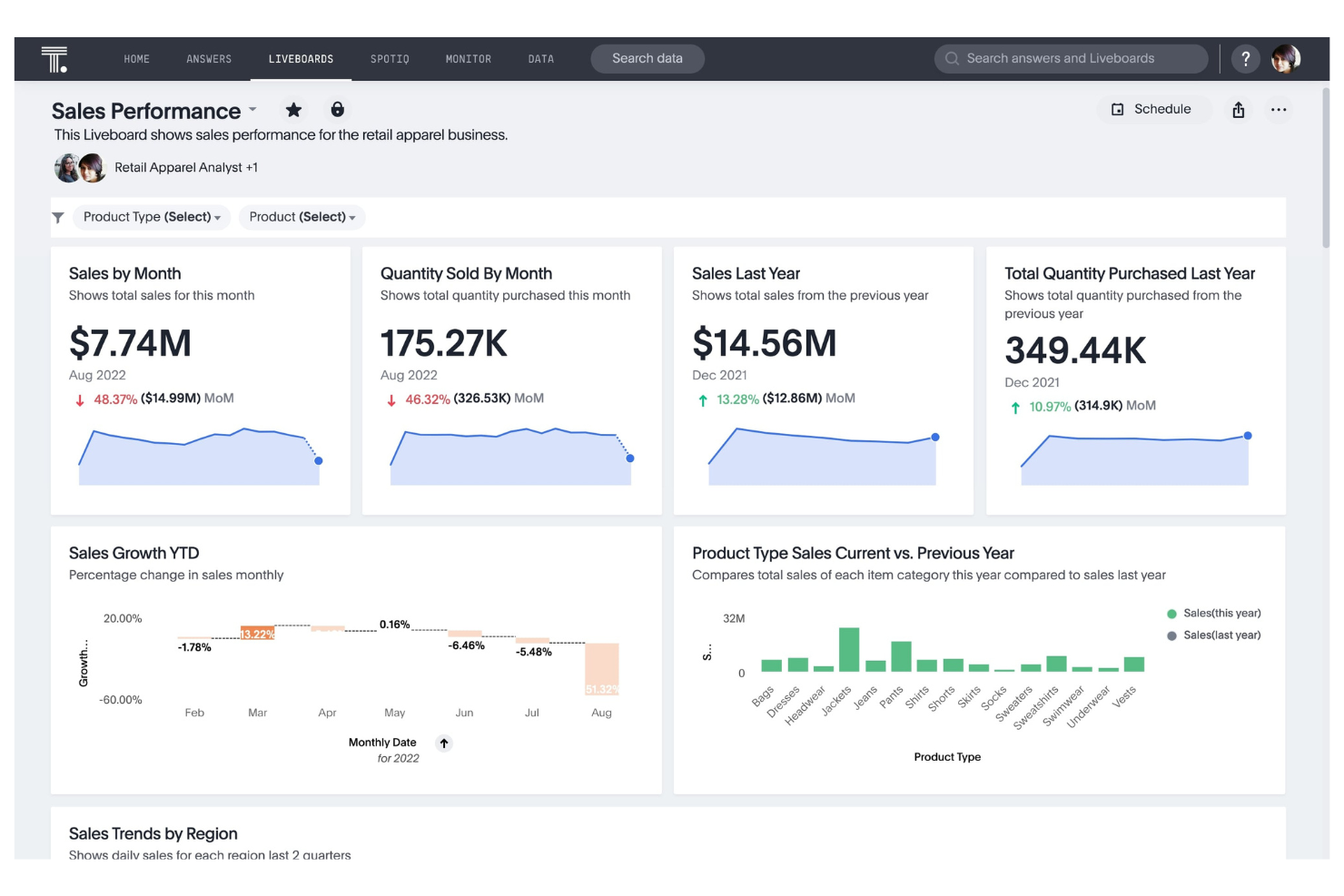
ThoughtSpot offre analisi basate sulla ricerca, progettate per i team finanziari e i responsabili aziendali che necessitano di risposte immediate dai dati cloud in tempo reale. La sua interfaccia intuitiva è adatta alle organizzazioni che desiderano consentire agli utenti non tecnici di creare e condividere dashboard finanziari su richiesta.
Per chi è più adatto ThoughtSpot?
Team finanziari e operativi di aziende di medie e grandi dimensioni che necessitano di analisi in tempo reale basate sulla ricerca.
Perché ThoughtSpot è una buona alternativa a Domo
Ho scelto ThoughtSpot perché il suo approccio basato sulla ricerca consente al mio team di digitare una domanda in linguaggio naturale, come 'mostrami i ricavi per regione rispetto allo scorso trimestre', e ottenere una risposta in tempo reale direttamente dal data warehouse cloud, senza dover creare prima alcun report.
Apprezzo particolarmente i Liveboards, il formato di dashboard interattivo di ThoughtSpot che interroga i dati in tempo reale invece di utilizzare istantanee memorizzate nella cache, consentendo ai team finanziari di visualizzare sempre i dati aggiornati senza attendere un ciclo di aggiornamento. Apprezzo anche SpotterViz, che genera dashboard pronte per la produzione da una richiesta in linguaggio naturale in pochi minuti.
Per i team che si stanno allontanando dalla struttura delle dashboard più rigida di Domo, questa combinazione di interrogazione in tempo reale e generazione di dashboard su richiesta rappresenta un cambiamento significativo.
Funzionalità principali di ThoughtSpot
- Analisi aumentata SpotIQ: Rileva automaticamente le anomalie, porta alla luce le tendenze nascoste e genera analisi delle variazioni dei KPI utilizzando l'apprendimento automatico.
- Ricerca relazionale: Consente agli utenti di digitare query in linguaggio naturale in una barra di ricerca e perfezionare le risposte generate dall'IA modificando i token di ricerca senza scrivere codice SQL.
- Analyst Studio: Un ambiente di lavoro incentrato sul codice in cui i team dati possono scrivere codice SQL, Python o R per preparare, strutturare e visualizzare i dati all'interno della stessa piattaforma.
- Analista IA Spotter: Un agente di IA conversazionale che risponde a domande complesse sui dati in linguaggio naturale, con feedback umano per migliorare l'accuratezza nel tempo.
Integrazioni di ThoughtSpot
Le integrazioni includono Snowflake, Databricks, Google BigQuery, Amazon Redshift, Microsoft Azure Synapse, Google Sheets, dbt, Fivetran, Alation e DataRobot.
Pros and Cons
Pros:
- Analisi basate sulla ricerca per ottenere risposte immediate dai dati
- Interrogazione in tempo reale dei data warehouse cloud
- Rilevamento di anomalie e tendenze basato sull'IA
Cons:
- Opzioni limitate per la personalizzazione delle visualizzazioni
- Nessuno strumento integrato per l'automazione dei flussi di lavoro

Strategy One
Ideale per la gestione delle performance e la pianificazione strategica
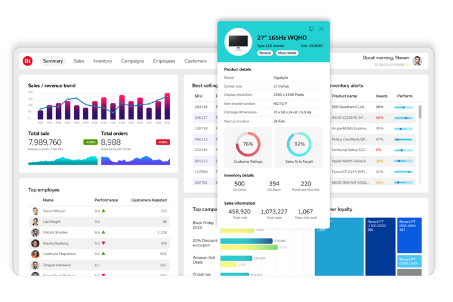
Strategy One è una piattaforma di pianificazione finanziaria e modellazione di scenari progettata per i team finanziari che gestiscono organizzazioni complesse e con più entità. È pensata per i professionisti che devono allineare i piani strategici con i dati finanziari in tempo reale e visualizzare l'impatto delle decisioni aziendali.
Per chi è più adatto Strategy One?
I responsabili finanziari di grandi aziende che cercano funzionalità avanzate di modellazione degli scenari e pianificazione strategica.
Perché Strategy One è una valida alternativa a Domo
Ho scelto Strategy One perché il suo livello semantico governato permette al mio team di definire una sola volta le metriche finanziarie, come ricavi, margine o abbandono dei clienti, e di applicare tali definizioni in modo coerente a ogni dashboard e report. In pratica, ciò elimina il rischio di calcoli contrastanti dei KPI quando i diversi reparti estraggono i propri dati.
Apprezzo anche le funzionalità di generazione automatica delle dashboard e delle narrazioni automatiche, che consentono al mio team di trasformare i dati finanziari grezzi in dashboard annotate e pronte per l'analisi, senza formattazione manuale. Per i team finanziari che gestiscono ambienti di dati estesi e provenienti da più fonti, la combinazione di analisi basate sull'intelligenza artificiale e governance di livello aziendale è qualcosa che la maggior parte degli strumenti autonomi per dashboard non offre a questa scala.
Funzionalità principali di Strategy One
- Intelligence contestuale: Sovrappone schede dati contestuali alle applicazioni web già utilizzate dal team, senza dover scrivere codice.
- Analisi mobili: Fornisce dashboard ottimizzate per l'uso tattile e l'accesso offline ai report direttamente sui dispositivi mobili.
- Analisi integrate: Integra le dashboard e i report di Strategy One in prodotti esterni con il proprio marchio.
- Reporting aziendale: Genera report impaginati ad alto volume e con precisione a livello di pixel su una piattaforma nativa per il cloud.
Integrazioni di Strategy One
Le integrazioni includono Microsoft Azure, Microsoft Power BI, Google Workspace, BigQuery, Gemini, AWS, Databricks, Snowflake e altro ancora.
Pros and Cons
Pros:
- La modellazione degli scenari supporta strutture complesse e con più entità
- Il livello semantico governato garantisce la coerenza dei KPI
- Le narrazioni automatiche generano informazioni utili annotate nelle dashboard
Cons:
- Richiede il supporto dell'IT per l'implementazione iniziale
- Personalizzazione limitata delle dashboard autonome
Altre alternative a Domo
Ecco alcune ulteriori alternative a Domo che non sono entrate nella mia selezione, ma che vale comunque la pena prendere in considerazione:
- SAP BusinessObjects BI Suite
Ideale per la reportistica aziendale in contesti operativi complessi
- Zoho Analytics
Ideale per la business intelligence self-service con unione automatizzata dei dati
- Dot
Ideale per approfondimenti aziendali automatizzati basati sull'IA


Cómo evalúo el software de email marketing asequible para startups
Analizo estas herramientas en dos niveles: las funciones básicas que toda plataforma debe tener para estar en la lista y los diferenciadores que distinguen a una para un fundador que envía su primera secuencia automatizada.
Funcionalidad principal (Condiciones indispensables para esta lista)
Cuando selecciono herramientas para mi lista, califico cada una en una escala de 0 (no ofrece la funcionalidad) a 5 (sobresale en esta área) para cada funcionalidad principal mencionada a continuación. Luego, convierto la puntuación total de la herramienta en un porcentaje. Cada herramienta debe alcanzar una puntuación total mínima del 65% para ser considerada para inclusión.
- Precios asequibles y escalables: Verifico si la plataforma ofrece un plan gratuito útil o una opción de bajo costo de entrada, y si los precios siguen siendo razonables a medida que tu lista de suscriptores crece de cientos a decenas de miles.
- Constructor de campañas de correo electrónico: Un buen editor de arrastrar y soltar con plantillas responsivas es clave aquí. Valoro cuán rápido puedes pasar de un lienzo en blanco a un anuncio de producto o boletín profesional.
- Gestión de listas y segmentación: Más allá de las importaciones básicas, evalúo si puedes etiquetar contactos y crear segmentos según comportamiento o atributos, como aislar usuarios en prueba que aún no se han convertido.
- Flujos de trabajo automatizados: Busco secuencias de varios pasos con lógica condicional. Una plataforma debe permitirte crear una serie de bienvenida que ramifique según las acciones de los suscriptores, no solo enviar una respuesta automática simple.
- Formularios de registro y páginas de destino: La herramienta debe incluir al menos formularios embebibles y ventanas emergentes. Algunas plataformas como Mailchimp y MailerLite también integran creadores de páginas de destino, lo cual también tomo en cuenta.
- Analítica e informes de entregabilidad: Las tasas de apertura y datos de clics son lo básico. También evalúo si la plataforma admite la configuración de autenticación de dominio y ofrece información sobre rebotes o entregabilidad para proteger tu reputación de remitente.
Una vez tengo una lista de herramientas que cumplen con estos criterios, considero qué distingue a cada plataforma.
Factores diferenciadores (¿Qué diferencia a los proveedores?)
Así es como comparo y contrasto a los diferentes proveedores:
Funciones destacadas
La generación de contenido con IA es clave. Las startups con equipos pequeños se benefician de herramientas que redactan líneas de asunto o sugieren textos, reduciendo el tiempo para lanzar una campaña. También reviso si una plataforma integra SMS junto al correo electrónico, ya que lanzar un producto en ambos canales desde un mismo panel es mejor que usar herramientas separadas. Las integraciones con e-commerce también importan, especialmente los conectores nativos con plataformas como Shopify o WooCommerce que activan flujos de carrito abandonado y post-compra automáticamente.
Más allá de las funciones
La entregabilidad es un aspecto que valoro mucho. Una startup que construye su reputación de remitente desde cero necesita herramientas que te guíen paso a paso en la configuración de SPF, DKIM y DMARC, no solo mencionarlas en un artículo de ayuda. Además, evalúo qué tan bien se conecta cada plataforma al ecosistema típico de una startup. Una API abierta o soporte para Zapier puede marcar la diferencia entre una herramienta que se adapta a tu flujo de trabajo y otra que se quede corta. Los recursos de incorporación son igual de importantes; los fundadores multitarea necesitan tutoriales claros y soporte receptivo incluso en planes gratuitos o de entrada.
Perché cercare un'alternativa a Domo?
Sebbene Domo sia una buona scelta per il software di dashboard finanziarie, ci sono diversi motivi per cui alcuni utenti cercano soluzioni alternative. Potresti essere alla ricerca di un'alternativa a Domo perché hai bisogno di…
- Maggiore controllo sull'hosting e sulla sicurezza dei dati
- Eliminare i costi elevati senza rinunciare alle funzionalità avanzate
- Opzioni di personalizzazione avanzate
- Preferire sistemi di gestione dei dati open source o autogestiti
- Ridurre le lacune nelle integrazioni con fonti di dati di nicchia
- Una curva di apprendimento più breve e una maggiore facilità d'uso
Se ti riconosci in una di queste situazioni, sei nel posto giusto. Il mio elenco contiene diverse opzioni di software per dashboard finanziarie più adatte ai team che affrontano queste difficoltà con Domo e cercano soluzioni alternative.
Funzionalità principali di Domo
Ecco alcune delle funzionalità principali di Domo, per aiutarti a mettere a confronto ciò che offrono le soluzioni alternative:
- Connettori dati: Domo offre centinaia di connettori preconfigurati per origini dati cloud e locali, consentendo di centralizzare i dati finanziari e operativi provenienti da piattaforme come Salesforce, NetSuite, Google Analytics e altre.
- Magic ETL: questo strumento visivo di trasformazione dei dati consente agli utenti di pulire, unire e preparare i dati per l'analisi senza scrivere codice, facilitando la creazione di dashboard finanziarie accurate.
- Generatore di schede: il generatore di schede di Domo consente agli utenti di creare visualizzazioni interattive e dashboard tramite un'interfaccia con trascinamento, supportando un'ampia gamma di tipi di grafici e layout personalizzati.
- Flussi di dati: automatizza complesse pipeline di elaborazione dei dati concatenando più fasi di trasformazione, assicurando che le dashboard finanziarie riflettano sempre i dati più aggiornati.
- Calcoli Beast Mode: crea metriche personalizzate e campi calcolati direttamente all'interno della piattaforma utilizzando un semplice editor di formule, con supporto per analisi e report finanziari avanzati.
- Avvisi e notifiche: configura avvisi automatici basati su soglie o anomalie nei dati finanziari, così il tuo team riceverà notifiche in tempo reale sulle variazioni importanti.
- App mobile: accedi a dashboard, report e visualizzazioni dei dati ovunque ti trovi grazie alle applicazioni mobili native di Domo per dispositivi iOS e Android.
- Controlli degli accessi basati sui ruoli: gestisci le autorizzazioni degli utenti a un livello granulare, assicurando che i dati finanziari sensibili siano accessibili solo ai membri del team autorizzati.
- Appstore: estendi le funzionalità di Domo con app e soluzioni preconfigurate dal Domo Appstore, inclusi strumenti di analisi finanziaria specifici per settore.
- Strumenti di collaborazione: condividi dashboard, commenta i dati e assegna attività all'interno della piattaforma per mantenere i team finanziari allineati e informati.